A New Level of Retail Experience
Young Living Malaysia
Bangsar South
The Brief
We were engaged by the brand to redesign their regional stores. From the get-go, we identified a few existing issues that had to be addressed. Firstly, the Young Living stores could no longer accommodate the increasing footfalls. Secondly, the workflow for the staff members was inefficient and thirdly, there was a lack of an educational platform for the visitors to understand the brand.
Our Approach
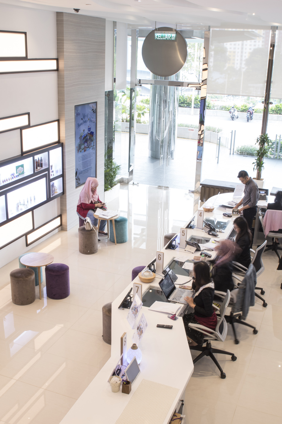
We planned, rebuilt and expanded the entire space by adding a mezzanine floor, thus establishing an ergonomic space that could cater to a higher volume of visitors. In the process, we seperated the traffic flow - sales and collection for existing members on the ground floor, and information and discussion areas for new members on the mezzanine floor.
We also customised trolleys that could fit x amount of merchandise by using the data on the number of products that were being sold by the hour, and in the ‘pick and pack’ storage area, we categorised the shelves with a naming system based on the urgency of transaction.
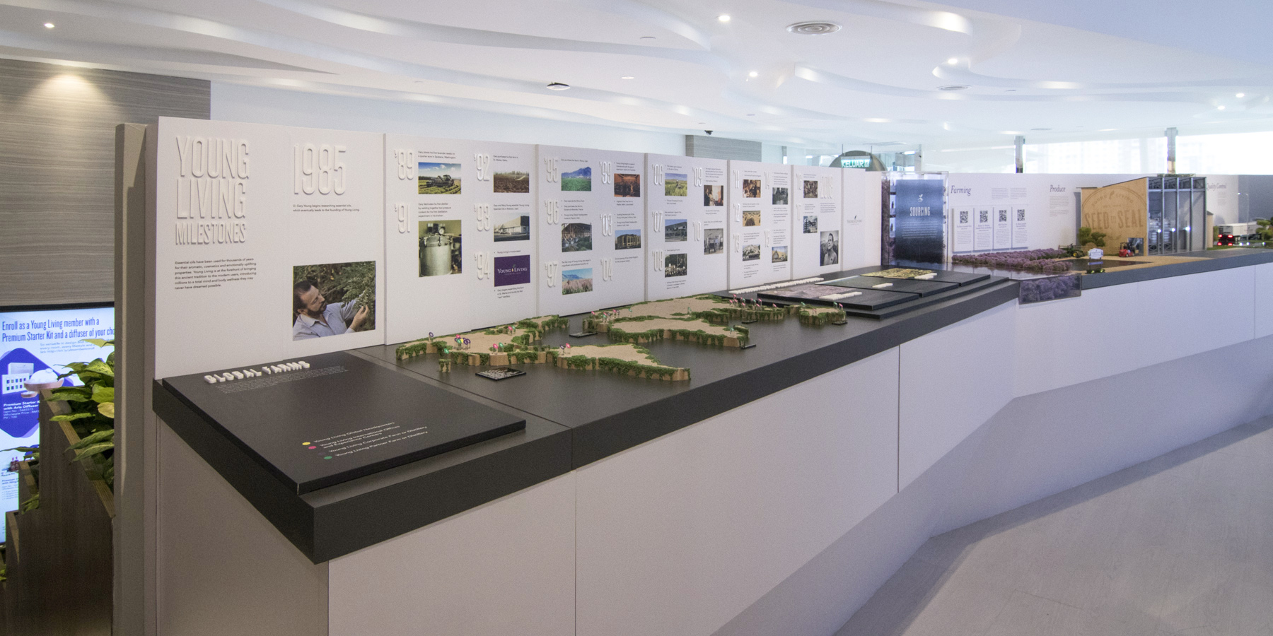
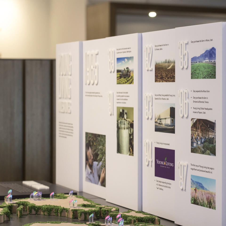
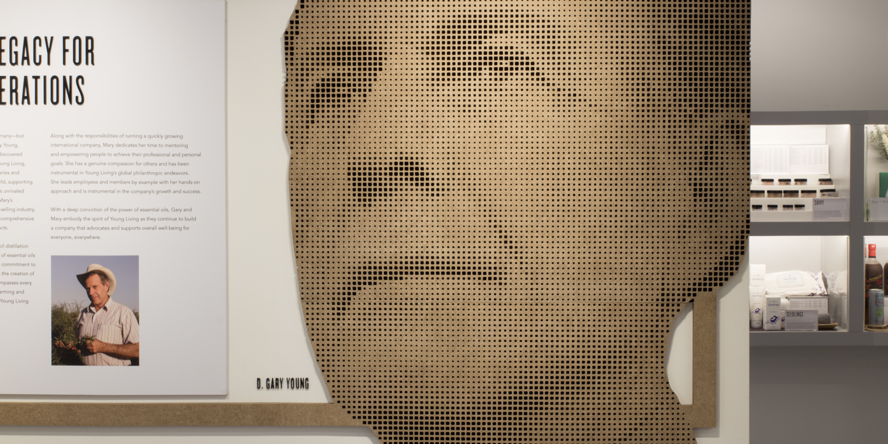
Lastly, on the mezzanine floor, we created an interactive brand experience, where new members could walk through the history and milestones of the brand, and learn more about the products with the help of miniature figurines and motion graphics. We also included a full product line-up for visitors to experience and test.
- Role Creative and art direction, packaging design, microsite design
- Completion 2018


